Invitations... a Labor of Love
Finally, here they are! I can't count the hours it's taken to put these together... and I don't think I want to, but I'm super pleased with the results.
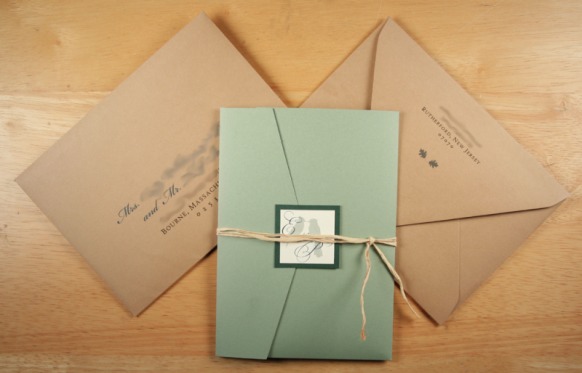
So, how did we do it? We got our paper supplies from Cards and Pockets (pocketfolds, cardstock and envelopes). The raffia ribbon came from A. C. Moore. A paper cutter, replacement blades, ink cartridges, and tape rollers we got from Staples. In all, if you count up ALL these supplies, the cost per mailed invite came out to about $3.75 each (I say it that way because we bought supplies for 100 invites, but are only sending out about 85).
Postage is still up for debate. Because of the raffia ribbon, postage would be $1.39 each (the ribbon makes the envelope bumpy and therefore "non-machineable"). Without the raffia ribbon, $0.61. I really think the raffia ribbon completes the look I was aiming for, so I'm hoping to just go for it.
I was inspired by an invitation featuring birds and trees that I saw on Etsy, made by seller lilribbers of LetterPunch Design. We composed the background images for the design in Photoshop, and manipulated the layout in Publisher, superimposing the text on the outlines of the trees, leaves, and birds.
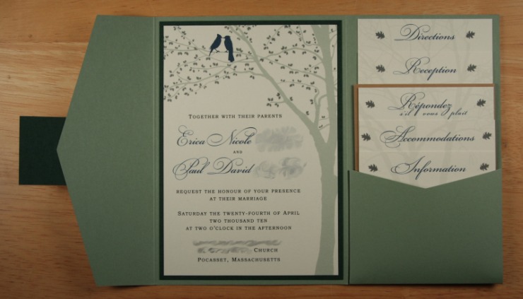
We made a "watermark" of a tree as background for the invitation inserts. Paul took a few pictures of trees and spent more hours than we'd like to admit to editing them in Photoshop to remove "extraneous" branches and background. I created a brush out of an image of a leaf and added the foliage to the tree in the invitation and also the "accent" leaves on the insert heading.
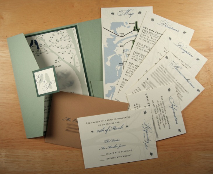
The map is derived from a Google map of the area, which I outlined and abstracted in Photoshop, and then added relevant street names and markers in Publisher. I used Beautiful ES and Beautiful Caps ES for the headings and name fonts and Bookman Old Style for the body text. On the envelopes I used Beautiful ES and High Tower Text.
